A little bit of Monica in my life
One analysis in the R community that caught my attention is Hilary Parker’s analysis of the most poisoned baby name in US history. I was surprised that my own name didn’t show up in the analysis. If Hilary had a huge loss in 1993, what happened to Monica in 1999?
For a period when I was a kid the name ‘Monica’ is what made the adults turn down the NPR broadcast. Its entrance into popular culture due to the Clinton Impeachment, a shoutout in Mambo No. 5, and also being name of the the least likable roommate on Friends (#bossy)1, wasn’t exactly the kind of material that was going to make me cool.
But now I am fond of my name again and I’m also looking back on that cultural moment with a new lens thanks to Monica Lewinsky’s awesome talk and essay. Still, with the babynames package on CRAN, I had to take a look at where ‘Monica’ falls on the poisoned names list.
🎙 One, two, three, four, five 🎙
The babynames package
Since Hilary conducted her analysis, it’s much easier to get the baby names data because it is now available as a package on CRAN. The data frame includes the year, sex, name, and frequency of the name. It also includes the proportion, prop, of people of that gender and name born in that year. One other difference is that we can now calculate the relative risk using the tidyverse.
library(babynames)
head(babynames)
## # A tibble: 6 x 5
## year sex name n prop
## <dbl> <chr> <chr> <int> <dbl>
## 1 1880 F Mary 7065 0.0724
## 2 1880 F Anna 2604 0.0267
## 3 1880 F Emma 2003 0.0205
## 4 1880 F Elizabeth 1939 0.0199
## 5 1880 F Minnie 1746 0.0179
## 6 1880 F Margaret 1578 0.0162str(babynames)## tibble [1,924,665 × 5] (S3: tbl_df/tbl/data.frame)
## $ year: num [1:1924665] 1880 1880 1880 1880 1880 1880 1880 1880 1880 1880 ...
## $ sex : chr [1:1924665] "F" "F" "F" "F" ...
## $ name: chr [1:1924665] "Mary" "Anna" "Emma" "Elizabeth" ...
## $ n : int [1:1924665] 7065 2604 2003 1939 1746 1578 1472 1414 1320 1288 ...
## $ prop: num [1:1924665] 0.0724 0.0267 0.0205 0.0199 0.0179 ...In Hilary’s analysis she looked at the top 1000 names in a given year, so I will follow that methodology.
Data wrangling
First I will limit the data set to the top 1000 names in a year and then calculate the relative risk and percentage loss.
As Hilary explains in her post, the relative risk is a measure used to compare proportions. In public health we use it to compare the proportion of people who get a disease who were exposed to something to the proportion of people who get a disease who were unexposed to something. For example, if 10 out of 100 people (10%) who get a flu shot end up getting the flu in a given year, and 15 out of 100 people (15%) who don’t get a flu show end up getting the flu in a given year, then we can divide .10 by .15 to get the relative risk of 0.67. This means that people who get the flu shot have 0.67 times the risk of getting the flu compared to those who don’t get the flu shot. In Hilary’s analysis, she calculates the relative risk as a loss percent to help us think of it as a decrease. In the flu example, the loss percent would be (1-0.67)*100 = 33% less likely.
Here’s how we can calculate this in the tidyverse.
library(tidyverse)

top1000 <- babynames %>%
  group_by(sex, year) %>%
  arrange(desc(n)) %>%
  mutate(rank = row_number()) %>%
  filter(rank <= 1000) %>%
  group_by(sex, name) %>%
  arrange(year) %>%
  mutate(relrisk = prop/lag(prop),
         loss_pct = (1-relrisk)*100)
The only problem with doing it like this is that if there are gaps that the name made it in the top 1000, the calculation is off. For example, look at the name Aarush. Aarush was in the top 1000 in 2010, then dipped below the top 1000 in 2011 to 2014, and then back in the top 1000 in 2015.
library(knitr)

top1000 %>%
  filter(name == "Aarush") %>%
kable()| year | sex | name | n | prop | rank | relrisk | loss_pct |
|---|---|---|---|---|---|---|---|
| 2010 | M | Aarush | 227 | 0.0001106 | 900 | NA | NA |
| 2015 | M | Aarush | 211 | 0.0001035 | 974 | 0.9358163 | 6.418369 |
Ok, let’s try this again.
top1000 <- babynames %>%
  group_by(sex, year) %>%
  arrange(desc(n)) %>%
  mutate(rank = row_number()) %>%
  filter(rank <= 1000) %>%
  group_by(sex, name) %>%
  arrange(year) %>%
  mutate(relrisk = ifelse(year == lag(year)+1, prop/lag(prop), NA),
         loss_pct = (1-relrisk)*100) %>%
  ungroup()
It works!
top1000 %>%
  group_by(sex, name) %>%
  filter(year != lag(year)+1) %>%
  arrange(name, year, sex)
## # A tibble: 13,573 x 8
## # Groups: sex, name [4,213]
## year sex name n prop rank relrisk loss_pct
## <dbl> <chr> <chr> <int> <dbl> <int> <dbl> <dbl>
## 1 2017 M Aaden 240 0.000122 888 NA NA
## 2 2015 M Aarush 211 0.000104 974 NA NA
## 3 1882 M Ab 5 0.0000410 943 NA NA
## 4 1885 M Ab 6 0.0000518 836 NA NA
## 5 1887 M Ab 5 0.0000457 921 NA NA
## 6 1890 M Abb 6 0.0000501 884 NA NA
## 7 1891 M Abbie 5 0.0000458 964 NA NA
## 8 1937 F Abbie 52 0.0000472 964 NA NA
## 9 1942 F Abbie 65 0.0000468 968 NA NA
## 10 1957 F Abbie 120 0.0000572 938 NA NA
## # … with 13,563 more rowsBiggest percent drops
OK, let’s see who has the biggest drops! Did I reproduce the list?
top1000 %>%
  arrange(desc(loss_pct)) %>%
  filter(sex == "F") %>%
  filter(row_number() <= 14) %>%
  select(name, loss_pct, year, n) %>%
kable()| name | loss_pct | year | n |
|---|---|---|---|
| Farrah | 78.08533 | 1978 | 332 |
| Dewey | 74.43853 | 1899 | 24 |
| Catina | 73.58773 | 1974 | 329 |
| Khadijah | 72.48679 | 1995 | 438 |
| Deneen | 71.88842 | 1965 | 421 |
| Hilary | 70.19101 | 1993 | 343 |
| Katina | 69.31745 | 1974 | 765 |
| Renata | 69.02648 | 1981 | 224 |
| Iesha | 68.91567 | 1992 | 581 |
| Clementine | 68.82256 | 1881 | 6 |
| Minna | 67.88056 | 1883 | 7 |
| Ashanti | 67.84702 | 2003 | 962 |
| Infant | 67.48330 | 1991 | 187 |
| Tennille | 66.79955 | 1978 | 141 |
These rankings are slightly different than Hilary’s but pretty darn close! I think the difference comes from the fact that I didn’t round the loss percent. Close enough!
🎺 Jump up and down and move it all around 🎺
So where does Monica stand? Let’s take a look at its loss percent compared to the other names.
Finding Monica in babynames
First I filtered the data set to see how the loss percent for Monica compares to the list of the top poisoned names.
top1000 %>%
  filter(name == "Monica") %>%
  select(name, year, loss_pct, n) %>%
  arrange(desc(loss_pct))
## # A tibble: 136 x 4
## name year loss_pct n
## <chr> <dbl> <dbl> <int>
## 1 Monica 1999 34.2 2133
## 2 Monica 1902 32.0 33
## 3 Monica 1998 24.7 3229
## 4 Monica 1914 21.8 156
## 5 Monica 1899 18.9 30
## 6 Monica 1919 18.3 178
## 7 Monica 1888 18.0 13
## 8 Monica 1918 17.3 223
## 9 Monica 1936 17.1 273
## 10 Monica 2013 16.8 597
## # … with 126 more rowsOnly a 34% loss for Monica in 1999 compared to 70% for Hilary in 1993 and 78% for Farrah in 1978.
Graphing it
Let’s take a look at the names side by side using ggplot2.
top1000 %>%
  mutate(percent = prop*100) %>%
  filter(name == "Monica" | name == "Hilary" | name == "Hillary") %>%
  ggplot(aes(year, percent, colour = name)) +
  geom_line() +
  labs(title = "Percent of girls given the name Hilary/Hillary or Monica over time",
       y = "Percent",
       x = "Year")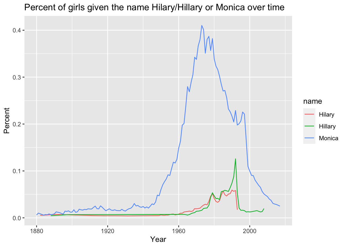
Wow, that really changes my perspective. Hilary may have the largest loss percent in a given year, but was the impact of the drop in Monica’s greater because there were more Monica’s to begin with? It’s hard to tell. It looks like there was already a downward trend after the 1970s, but that the trend started to level off in the 1990s (maybe Monica from Friends wasn’t so unpopular after all?!), before plummeting in ’98 and ’99.
🎵 And if it looks like this then you’re doing it right 🎵
The risk difference
In public health we use both the relative risk2 and the risk difference. They provide two different perspectives on the same information, and the usefulness of each measure depends on what question you are hoping to answer3. When the question is about the population-level impact of a factor on an outcome, then the risk difference is a more useful measure. When the question is about the strength of an association, the relative risk is the best option. The question about which baby name was the most poisoned–that is, which name had the strongest drop in popularity–is a question about the strength of an association.
However, when I looked at the plot above, a new question came to mind: did the drop in the baby name Monica have a greater impact in terms of the overall number of babies being named in the 90s?
In more detail, The risk difference (RD) is the difference in proportions. It tells us what the excess risk of disease is among those who have been exposed to something vs. those who have not been exposed. In a study on alcohol use and breast cancer4, a 40-year-old woman has an absolute risk of 1.45 of developing breast cancer in the next 10 years. If she is a light drinker, this risk becomes 1.51 percent. The risk ratio is 1.51/1.45 = 1.04, or a 4% increase in risk, which seems like a non-negligible amount. However, the risk difference is 1.51-1.45 = 0.06, or an excess risk of .06 per 100. That’s 6 people for every 10,000 light drinkers, which is a pretty low population impact. When you put it in absolute terms, the RD brings a different perspective to certain types of risk.
The risk difference in babynames
What would the risk difference say about these poisoned names? I’ll calculate the risk differences in the babynames data set. In this analysis, we can think of the year as the “exposure” and the name as the “outcome.” We can then calculate the “risk” or probability of being named Monica in any given year compared to the prior year. To make this more interpretable, I also calculated the excess risk, or how many people were named Monica in a year per 10,000 people named compared to the previous year, by multiplying the risk difference by 10,000.
rds <- top1000 %>%
  group_by(sex, name) %>%
  arrange(year) %>%
  mutate(riskdiff= ifelse(year == lag(year)+1, prop - lag(prop), NA),
         excessrisk_per10000 = round(riskdiff*10000,1)) %>%
  ungroup()

rds %>%
  filter(sex == "F") %>%
  arrange(riskdiff) %>%
  filter(row_number() <= 14) %>%
  select(year, name, n, relrisk, loss_pct, riskdiff, excessrisk_per10000) %>%
kable()| year | name | n | relrisk | loss_pct | riskdiff | excessrisk_per10000 |
|---|---|---|---|---|---|---|
| 1937 | Shirley | 26816 | 0.7459047 | 25.409533 | -0.0082912 | -82.9 |
| 1936 | Shirley | 35159 | 0.8372019 | 16.279809 | -0.0063452 | -63.5 |
| 1950 | Linda | 80432 | 0.8821419 | 11.785807 | -0.0061105 | -61.1 |
| 1951 | Linda | 73972 | 0.8755442 | 12.445582 | -0.0056921 | -56.9 |
| 1985 | Jennifer | 42650 | 0.8238794 | 17.612060 | -0.0049392 | -49.4 |
| 1952 | Linda | 67088 | 0.8807161 | 11.928385 | -0.0047766 | -47.8 |
| 1970 | Lisa | 38964 | 0.8326375 | 16.736249 | -0.0042753 | -42.8 |
| 1957 | Deborah | 40070 | 0.8224526 | 17.754744 | -0.0041239 | -41.2 |
| 1954 | Linda | 55381 | 0.8757818 | 12.421825 | -0.0039456 | -39.5 |
| 1958 | Cynthia | 31003 | 0.8008784 | 19.912163 | -0.0037328 | -37.3 |
| 1883 | Mary | 8012 | 0.9475668 | 5.243321 | -0.0036927 | -36.9 |
| 1977 | Amy | 26731 | 0.8150250 | 18.497499 | -0.0036882 | -36.9 |
| 1938 | Shirley | 23769 | 0.8556230 | 14.437703 | -0.0035140 | -35.1 |
| 1953 | Linda | 61275 | 0.9006528 | 9.934718 | -0.0035037 | -35.0 |
So in absolute terms, the biggest drops were among names that have higher frequencies. The overall impact is greater. There is a decrease of 83 Shirley’s per 10,000 babies born in the year 1937 compared to the prior year. Sorry Shirley!

Hilary/Hillary and Monica are nowhere near the top losses if we look at the risk difference.
But what if we compare Hilary to Monica? Who has the biggest drop in absolute terms?
rds %>%
  filter(sex == "F") %>%
  filter(name == "Monica" | name == "Hilary" | name == "Hillary",
         year > 1990) %>%
  arrange(riskdiff) %>%
  filter(row_number() <= 10) %>%
  select(year, name, n, riskdiff, excessrisk_per10000) %>%
kable()| year | name | n | riskdiff | excessrisk_per10000 |
|---|---|---|---|---|
| 1993 | Hillary | 1064 | -0.0007180 | -7.2 |
| 1999 | Monica | 2133 | -0.0005702 | -5.7 |
| 1998 | Monica | 3229 | -0.0005462 | -5.5 |
| 1993 | Hilary | 343 | -0.0004097 | -4.1 |
| 1994 | Hillary | 408 | -0.0003304 | -3.3 |
| 1993 | Monica | 3900 | -0.0003101 | -3.1 |
| 1991 | Monica | 4156 | -0.0001239 | -1.2 |
| 2000 | Monica | 1990 | -0.0000984 | -1.0 |
| 2003 | Monica | 1613 | -0.0000964 | -1.0 |
| 2001 | Monica | 1793 | -0.0000920 | -0.9 |
And Hillary wins with an excess risk of -7.2 per 10,000 babies in 1993! In 1993, there were about 7 fewer babies named Hillary than in 1992 for every 10,000 babies born. It’s even larger if you combine Hilary and Hillary. Interestingly, Hillary had a larger risk difference compared to Hilary in 1993. Using the risk ratio and risk difference, Hilary is the more poisoned name.

P.S. Seriously, watch this talk or read this story by Monica Lewinsky. It’s inspiring and adds a lot to current conversations about harassment and bullying.
I’ll admit that I’ve never actually watched Friends, but this is the impression I got from random clips!↩︎
The relative risk is also referred to as the risk ratio or the cumulative incidence ratio in epidemiology. I know, why don’t we just stick to calling it one thing?!↩︎
The usefulness of these measures is often the source of a lot of confusion in the media when there are stories about the benefit of certain treatments and screenings, for example, the benefits of mammography or the harms of alcohol use and birth control. One reason I love The Upshot is because they do an excellent job of explaining this to a non-epidemiologist audience.↩︎
https://www.nytimes.com/2017/11/10/upshot/health-alcohol-cancer-research.html↩︎